Payment component customization
After integrating the payment component, the default user interface (UI) styling is applied.
You can customize the styling to match your brand's visual identity, including fonts, colors, and layout in your:
- Checkout page
- Dashboard
Via your checkout page
To edit the default styling of the component:
-
Select each CSS class you want to edit.
-
Add the relevant CSS properties and set the values.
CSS class selectors
CSS class What it does .msp-container-uiSelects the payment component .msp-ui-payment-formSelects the payment form .msp-ui-method-headerSelects the payment .msp-ui-method-imageand heading.msp-ui-method-imageSelects the payment method logo .msp-ui-form-groupContains the .msp-ui-form-controland.msp-ui-form-label.msp-ui-form-labelSelects the field labels in the payment form .msp-ui-form-controlSelects the fields in the payment form .msp-ui-rowContains two .msp-ui-col-2elements.msp-ui-col-2Contains .msp-ui-form-group.msp-ui-separatorSelects the space before and after the form fields

Example
Add the following to your CSS to edit the payment component to add a:
-
5-pixel
border-radiusto the form fields -
Shadow to the fields on
focus -
10-pixel
border-radiusto the component container -
Light gray
background-colorto the component container.msp-ui-form-control { border-radius: 5px } .msp-ui-form-control:focus { box-shadow: 0 7px 7px rgba(0, 15, 45, 0.2) } .msp-container-ui { border-radius: 10px; background-color: #f8f9fa; }
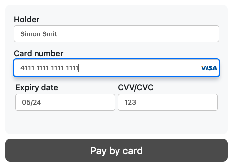
The payment component now looks like this:
Via the dashboard
- Sign in to your MultiSafepay dashboard .
- Go to Websites, and then click the relevant website.
- On the Website profile page, under Style your checkout solution > Payment component, click Edit.
- On the Components settings page, under Preview - Default, select whether you want to:
- Apply the styling from another saved template.
- Edit an existing template.
- Style a new single payment method component.
- Style a new multiple payment method component.
- View the style in JSON format.
-
Under Configure page style, you can customize the appearance of your payment components.
Check the template simulator guide below more information about how to style your components.
-
To set this as your default template, select the Set as default template checkbox.
-
In the Save template as field, enter the name of the template (used as the
template_id), and then click Submit settings.
Template simulator
Template simulator
The template simulator provides a preview of your payment page. Here, you can:
- Set the Hex color for the background and text.
- Set the size in pixels (px) for the font.
- Set the font family, style, and weight.
Payment methods
Customize the look of all payment methods and forms. Here, you can:
- Set the Hex color for the background, text, and borders. You can also set a color for when the user hovers over each payment method.
- Set the size in pixels (px) for the font, border width and radius, and box shadow.
- Set the font family, style, and weight.
- Set the border style.
Payment form
Customize the appearance of your payment forms using the settings below. These options are divided into two categories:
Under General:
- Set the Hex color code for general background color, text, border, links and labels.
- Set the size in pixels (px) for the labels.
- Set the label's font weight.
Under Inputs:
- Set the Hex color code for the input's background, text, borders, placeholder text, focus and errors.
- Set the size in pixels (px) for the input's font, border width and radius.
- Set the font family, style and weight. Set the border style.
Gateways settings
Customize the color and text for Apple Pay and Google Pay payment components.
To preview the changes, go to Review - Default, click Select component view > Express methods (Google & Apple Pay).
- Click on the Style Apple Pay checkbox to enable customization for Apple Pay.
- Click on the Style Google Pay checkbox to enable customization for the Google Pay.
Settings
- Click the Embed mode checkbox to embed your payment component into your page. Enabling this settings will disable background and border customization for payment forms. Inputs can still be customized.
⚠️ Note: This only applies to single components. - Enable the MultiSafepay Payment Button for multiple payment components by clicking the checkbox. To customize the appearance of this button, go to the Primary Button.
Primary button
If you've enabled the MultiSafepay Payment Button in the Settings section, you can customize its appearance:
- Set the Hex color code for the background, text and border. You can also change the color for mouseovers.
- Set the size in pixels (px) to change font size, border width, shadow and radius.
- Set the font weight by clicking the Font weight dropdown menu.
Support
Email [email protected]
Updated 6 days ago